Black & Purple Flowers:
The Dramatic Pairing Rules
(That Always Look Rich)
If you’ve ever stared at a near-black bloom and wondered, “How do I get that look at home?”—you’re in the right place. Today we’ll map the pairing logic for black and purple flowers, plus the supporting cast (black-blue and black-white combos) that makes dark blooms feel rich—not muddy.
“Dark flowers don’t disappear in the garden… they become the scene.”
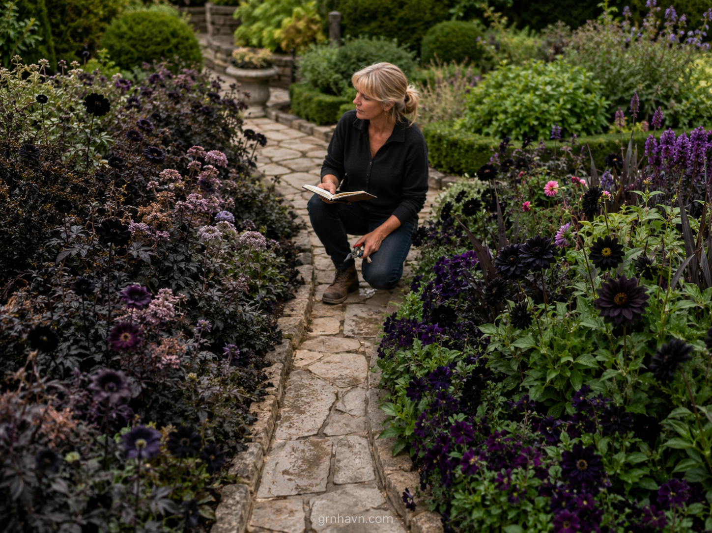
I’ve planted black and purple flowers in three very different realities—windy outdoor borders, humid container corners, and that “too-bright” patio where colors usually wash out. And here’s what I learned the hard way: most people don’t need more flowers… they need better pairings. Near-black blooms look luxurious when the surrounding colors either (1) sharpen contrast like a spotlight, or (2) harmonize so the dark stays deep and velvety.
Think of black like the tailoring in an outfit: it shapes everything around it. Purple adds a romantic, nocturnal glow. Blue cools the palette so the dark blooms read as richer, not lighter. And white? White is your “clean edit”—the punctuation that makes borders crisp and bouquets cinematic. In this guide, I’ll show you the exact rules I use when designing garden color schemes, building bouquet ideas, and selecting companion plants that protect dark flower pairings from fading or turning flat.
Here’S What You’Ll Walk Away With
- Contrast vs harmony—so your near-black florals stay rich in real daylight.
- Best pairings for black and purple depth (plus season-ready companion plants).
- Black-blue + black-white strategies for high-end garden color schemes and bouquets.
- Indoor container pairing tips (including light requirements and container color strategy).
- Common mistakes that make black-purple combos wash out or go muddy.
Quick facts
Why Black Flowers Look So Good With Other Colors
Let me be honest: “black flowers” are usually near-black—deep burgundy, ink-purple, or indigo that reads as black from a distance. That’s why pairing becomes everything: you’re not just matching colors, you’re matching how the eye interprets depth. When black blooms sit next to brighter hues, the dark doesn’t flatten—it turns into a frame.
Contrast vs harmony
Here’s my practical rule from years of garden color schemes and bouquet ideas: contrast is what makes a border feel dramatic, while harmony is what keeps it looking expensive. Contrast looks like: black + white edges, black + cool blue highlights, black + a vivid purple “glow.” Harmony looks like: black + deep plum, black + soft lavender, black + burgundy tones that don’t fight the dark.
“Black blooms behave like velvet—pair them wrong and they go flat; pair them right and they glow.”
If you want a fast test before you commit: stand back at the distance you usually view the bed. If your dark florals look like they’re “dimming,” add a clean contrast (white or pale silver foliage). If they look like they’re “floating,” add a close harmony (deep purple companions) to anchor the scene.
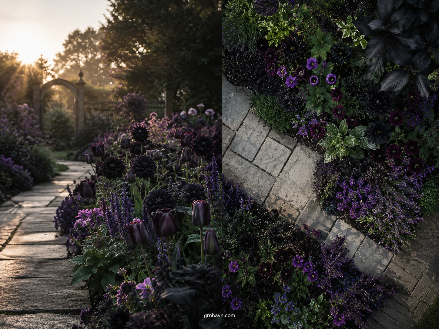
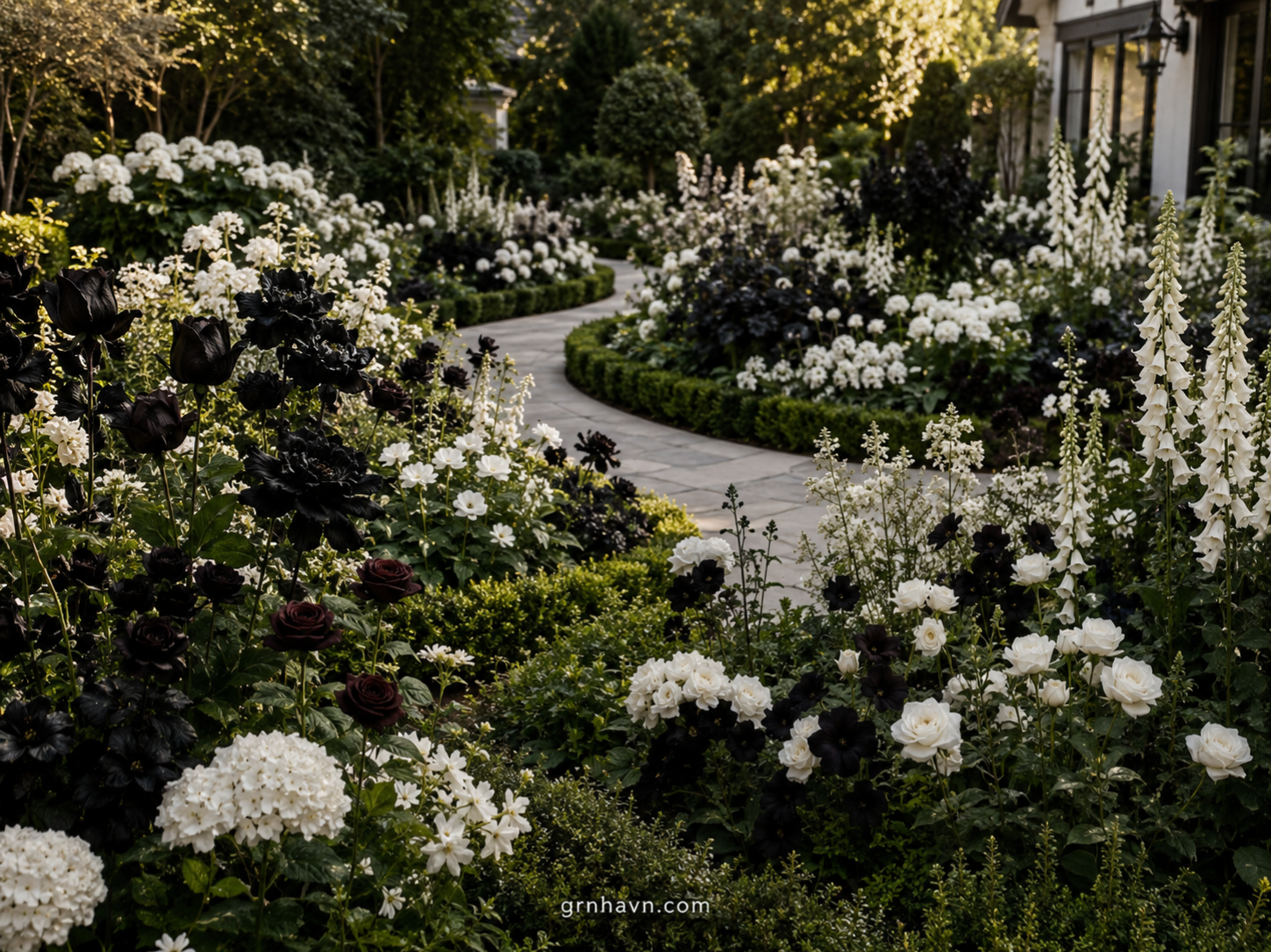
Black And Purple Flowers
This is the pairing that makes people stop walking. black and purple flowers create a “night garden” feel—especially when you mix blooms that read as ink with others that carry true violet color. The trick is to choose purple companions that behave like lighting: they should brighten the shadow, not compete with it.
Best pairings for rich, near-black depth
In my own beds, the richest combinations usually include: deep purple + near-black anchors (for velvet harmony) and violet + white accents (for crisp edge control). Case example: in one border, I planted deep-purple salvia with darker near-black dahlias, then added a small amount of white alyssum around the perimeter. The result wasn’t just “pretty”—the white stopped the dark from looking muddy and made the purple look saturated even in late afternoon.
For near-black florals, aim for companions with either: (a) a clear purple spectrum (plum, grape, indigo-purple), or (b) cool-toned leaves (gray-green, blue-green, or smoky foliage). Avoid warm oranges and overly pink companions unless you’re intentionally creating a high-drama contrast.
“Near-black flowers don’t need more attention—they need the right color neighbors to reflect light back to them.”
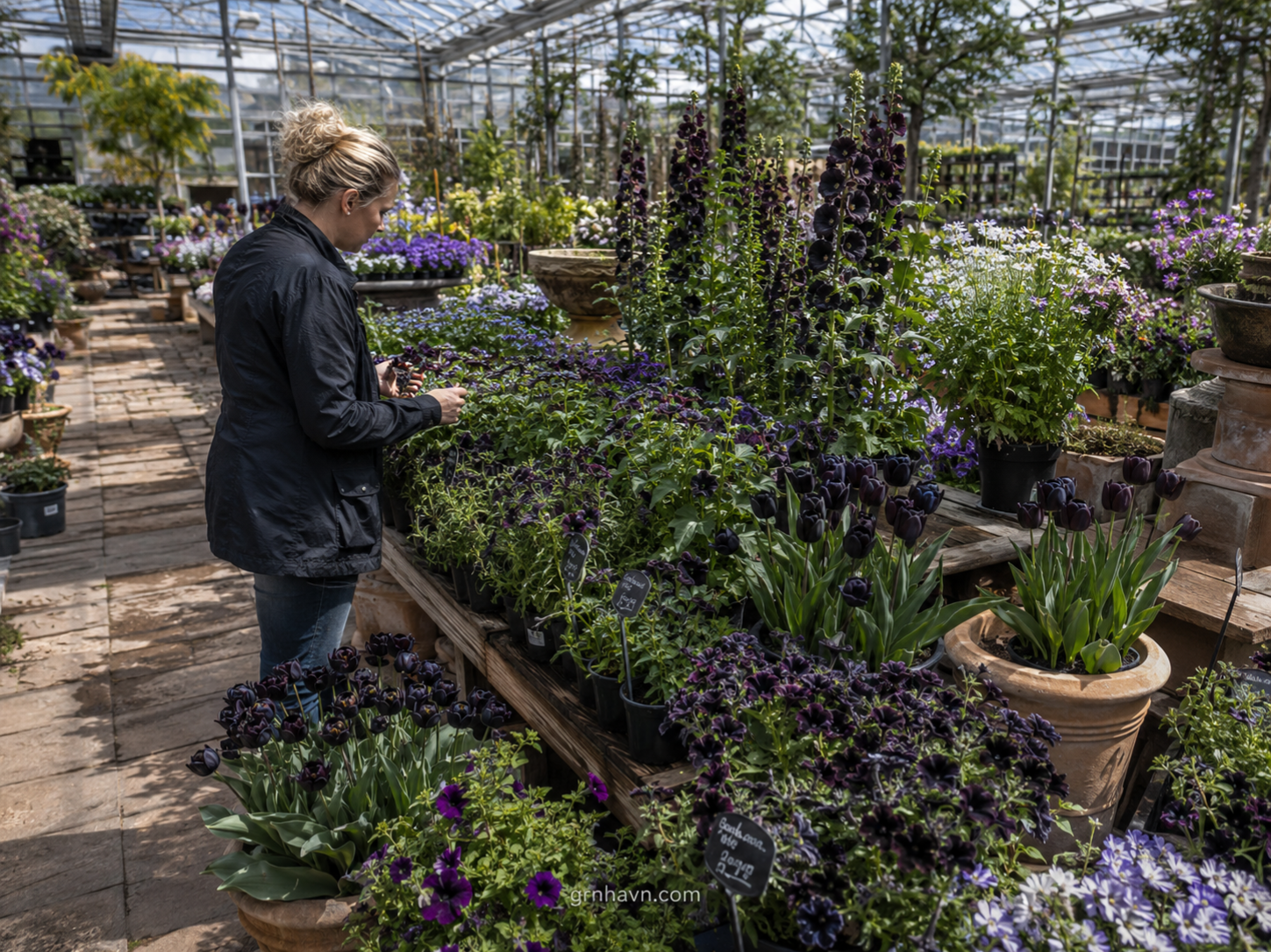
Suggested plant types (seasonal tips)
To keep the look consistent across seasons, I build with “repeatable textures.” In spring and early summer (when your palette is still forming), add violet-friendly structure plants like purple-leaf varieties, then “pulse” the dark bloom period with your main anchors. In USDA zones and Europe’s spring weather logic, treat frost-date timing like a calendar: plant out after your last frost in the US (zone-dependent; typically when nights are reliably mild). In Europe, follow your local soil-warming and frost risk—especially if you’re planting dahlias and tender flowering companions.
Outdoor option pattern: spring = structure + early violet, summer = near-black anchors + violet bloomers, fall = darker foliage + “late drama” blossoms. Indoor container pairing: choose compact anchors (or single-stem tall varieties for drama) and keep purple companions close enough to feel cohesive, not crowded.
Most gardeners find a quality planting mix and organic soil conditioner at a local nursery, garden center, or home improvement store—look for products meant for flowering containers or soil for bulbs/tubers. If you’re in Europe, the same logic applies: seek mixes labeled for flowering plants and good drainage.
Buying tip from experience: for near-black florals, prioritize drainage + steady nutrition. Choose a mix that won’t stay soggy and add a controlled-release fertilizer or compost that won’t “spike” growth. Overfeeding or keeping roots wet can dull color—so think “consistent, not constant.”
For quick online options, check the curated picks on Amazon below, or use the comparison list for the right texture and nutrient balance.
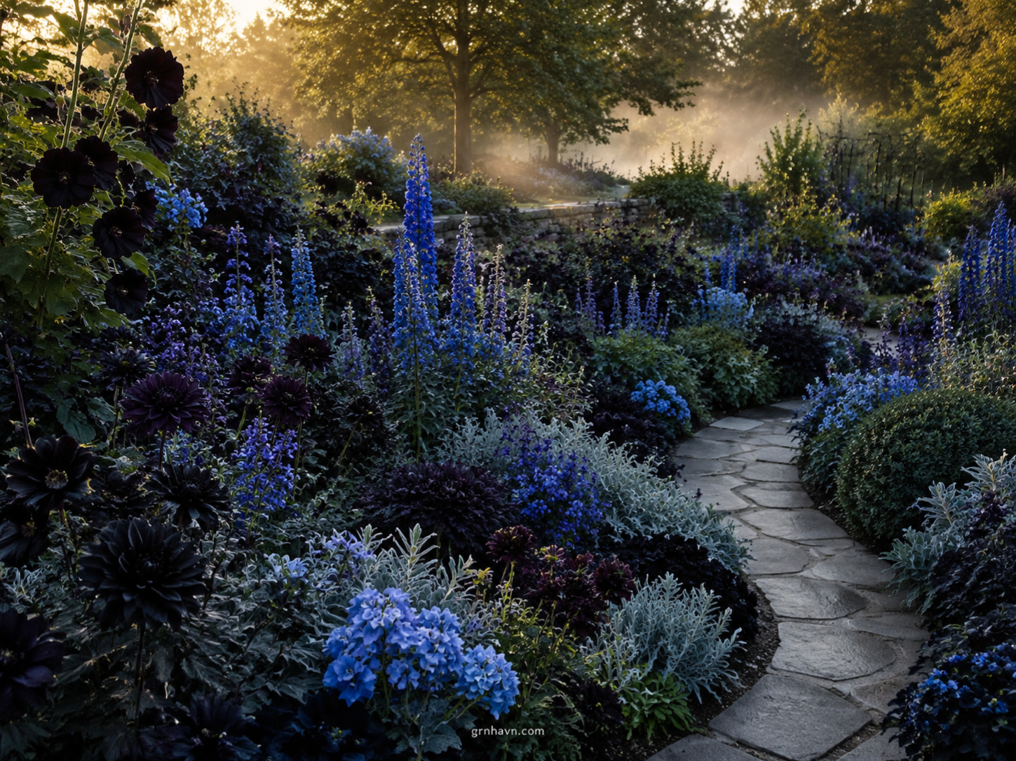
Black And Blue Flowers
If black-purple is “night romance,” then black and blue flowers are “cinematic cool.” Blue is a cheat code: it makes dark petals look deeper because the eye reads blue as a cool contrast partner. That’s how you get dark flower pairings that feel expensive instead of heavy.
Choosing cool-toned companions
When I’m designing garden color schemes with black-blue, I aim for companions that live on the cool side of the color wheel: periwinkle, cornflower, indigo, steel-blue foliage, and silver-gray leaves. Practical experience: in a balcony planter, I switched from warm pink companions to blue-gray foliage, and suddenly the “black” blooms looked almost inky—even in partial shade.
Getting the “black-blue” look
Build it like this: anchor with near-black blossoms (one main variety or a tight cluster), lift with mid-blue blooms, finish with white or pale silver for a crisp edge. If your blue looks too pale, don’t add more blue—add a black anchor or a deeper indigo purple to restore contrast.
“Blue doesn’t compete with black—it cools the shadows until they look deliberate.”
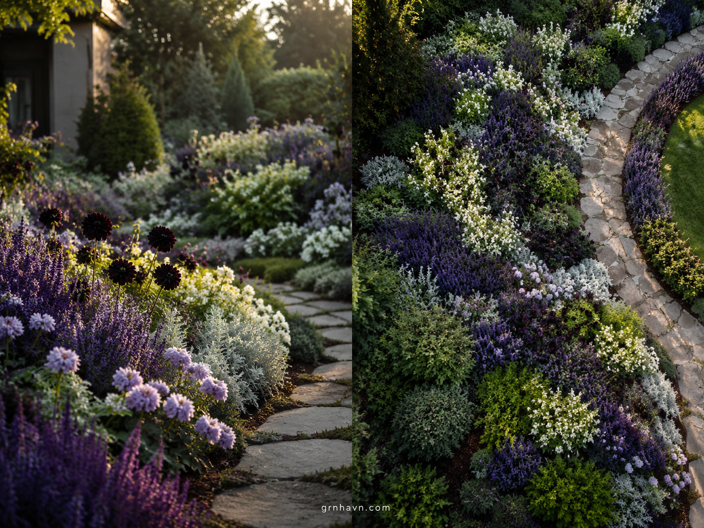
Black And White Flowers
black and white flowers are the cleanest way to make dark blooms feel intentional. White acts like a highlight pen: it separates shapes, sharpens edges, and helps dark flower pairings read clearly from a distance. If you’ve ever felt your near-black flowers looked “muddy,” this is usually the fix.
Clean contrast for borders and arrangements
Use white in three smart places: (1) the border perimeter, (2) between dark clusters to create “breathing room,” and (3) inside bouquets as a structural filler (think small blooms or airy textures). In one wedding-season arrangement I styled, the black-and-white contrast kept the palette elegant instead of gothic-heavy—because the white made every dark petal feel crisp rather than dull.
Quick bouquet ideas: add white as the “frame,” then layer purple or blue near-black blooms as the “center story.” For garden color schemes, pair white with deep purple foliage or blue-gray textures so the palette doesn’t become stark.
“White isn’t brightness—it’s clarity. It teaches black where to stand.”
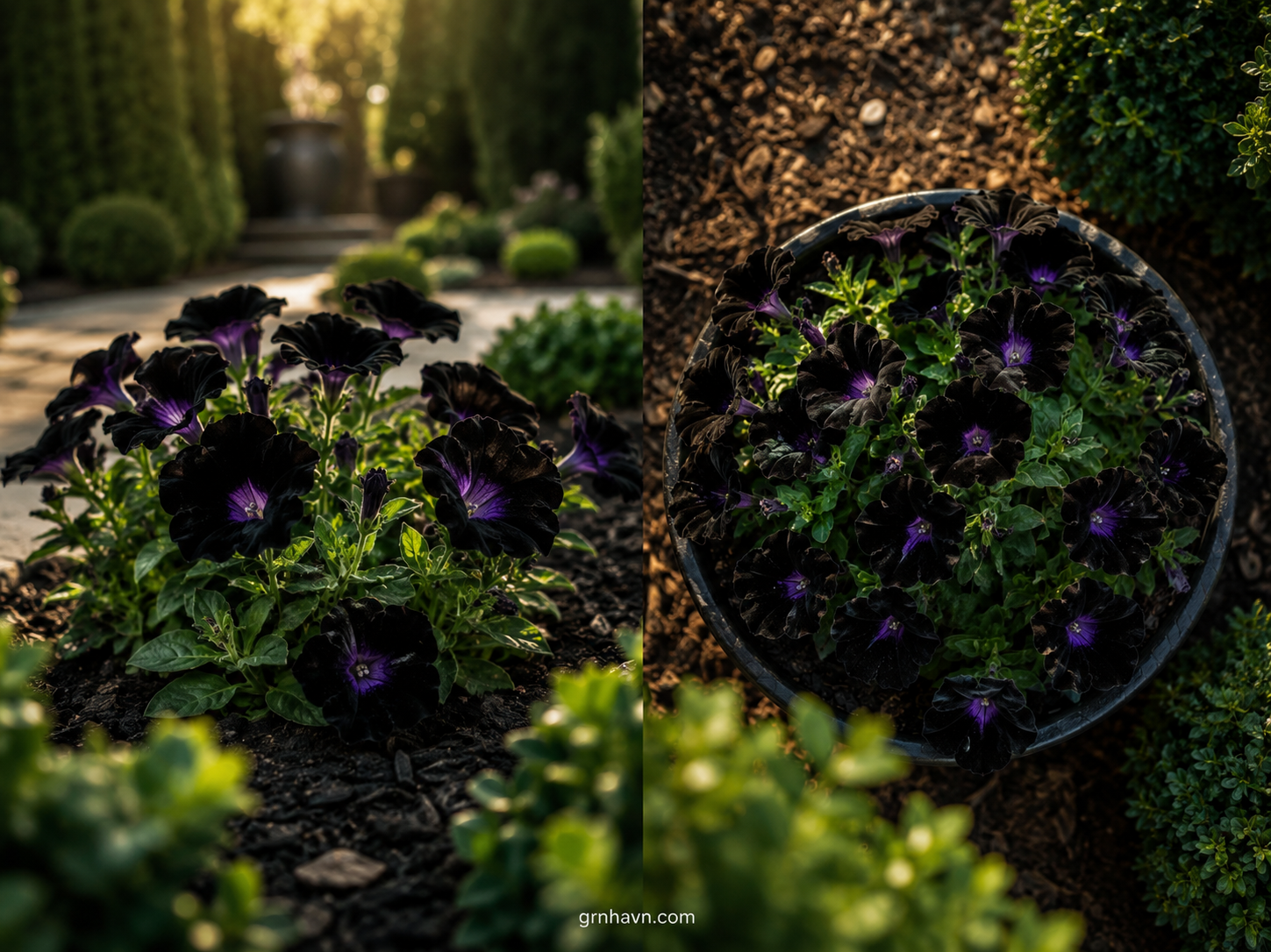
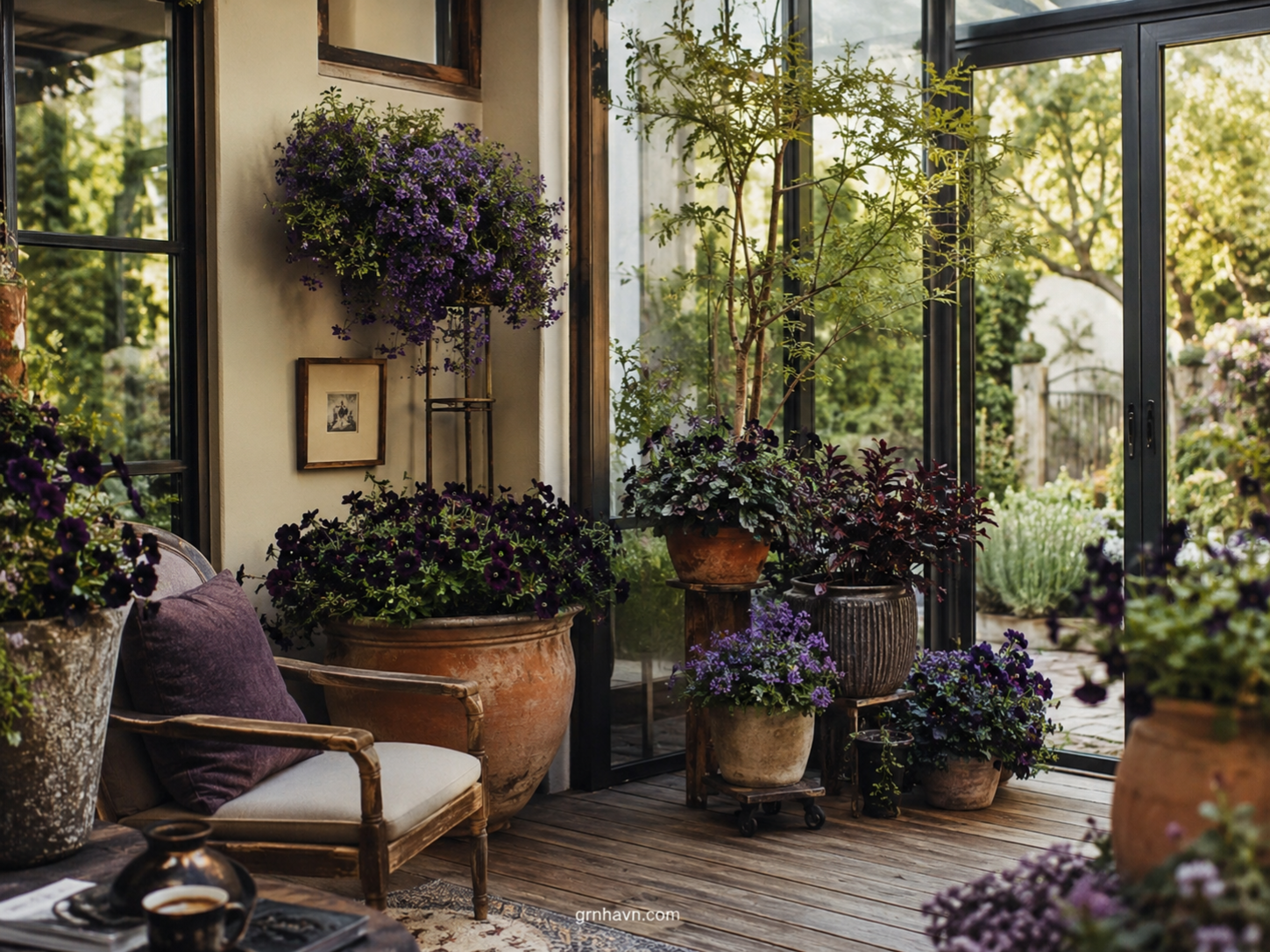
Pairing For Indoor Planters
The indoor version of black and purple flowers is all about controlled light and clean composition. Outdoors, you get natural contrast; indoors, you often get one big problem: colors flatten if the light is weak or overly warm. The fix is not “more fertilizer.” The fix is container color strategy + light planning.
Container color strategy
For dramatic dark flower combinations, containers should either disappear (black/espresso pots) or act as a stage (light stone/cream). Dark pots feel sleek, but light pots help the blooms read clearly—especially in dim rooms or north-facing windows. My preference? For black-purple indoors, a light container with a deep saucer creates a high-end “editorial” look.
Light requirements for dark blooms
Aim for the brightest spot you can manage. If you’re growing dahlias or near-black tuber varieties, keep in mind that “bright” often means several hours of direct light. Use frost-date logic for outdoor transitions: once outdoor temperatures are reliably mild (use °F + °C comparisons), you can acclimate containers gradually. In USDA zones, remember that nighttime temps matter as much as daytime warmth. In Europe, watch your local spring cooling patterns and avoid sudden cold snaps.
“Indoor dark blooms don’t ask for kindness—they ask for light.”
Common Mistakes
I get it—when you’re learning, it’s easy to blame the plant. But with dark flower pairings and especially black and purple flowers, the real culprits are often environmental and design-related. Let’s troubleshoot the most common issues so your near-black florals look rich in real life, not just in photos.
When colors wash out
Colors wash out when there isn’t enough contrast, the light is too weak, or watering/feed swings are too dramatic. If purple looks dusty and black looks “brown,” check: light first, then watering rhythm, then whether your companions are adding enough color logic. Case study: a client’s bed looked perfect for two weeks, then went dull. The issue wasn’t the bloom variety—it was late pruning that reduced airflow and delayed vigorous regrowth, plus inconsistent watering.
Too many similar dark shades
Too many similar near-black shades can create visual confusion. Your eye can’t separate forms, so the bed becomes one dark block. Instead of adding more black, add one anchor contrast: white accents for border clarity, or blue companions for cool depth. Think “layering,” not “stacking.” Keep one dark hero, then support it with a limited palette.
“The luxury look isn’t more darkness. It’s controlled darkness—with one bright truth beside it.”
Next Step
Where To Buy Black Flowers Near Me (And What To Ask For)
If you’re searching locally, start with neighborhood nurseries, garden centers, and seasonal markets. Here’s what to ask (this part matters): “Do you have varieties that read as black in daylight—near-black, ink-purple, or very deep burgundy?” Then ask about light needs: “Will they keep their depth in my sun pattern?” If you’re in Europe, ask how the supplier handles cool-season recovery and whether the variety performs in your local temperature ranges.
In the US, you can also use frost-date logic to plan purchases: buy tender-starts early enough to pot up, then transplant after your last frost and warm-enough soil. In Europe, follow spring temperature swings similarly—especially if you’re planting tubers or early-blooming anchors.
“Bring the right words to the nursery, and the right flowers will magically appear.”
Final Verdict
After all the trials, I’ll stand by this: black and purple flowers look richest when you design with restraint. Pick one near-black anchor, give purple the job of “glow,” and use white or blue to sharpen contrast. Keep watering steady (not soggy), avoid overwatering, and don’t prune too late—because late pruning can interrupt flowering rhythm. Do that, and your dark flower pairings will feel like a luxury editorial spread—calm, cinematic, and completely you.
What Not to Do
- Overwatering (dark blooms turn dull when roots stay wet).
- Late pruning (interrupts flowering rhythm and reduces vigor).
- Too many similar dark shades (creates a flat, one-tone block).
Faq: Black + Purple Flower Pairing Questions
1. What are the best black-and-purple flower pairings?
In my experience, the best pairing is near-black anchors (ink-purple/dark burgundy) with true purple “glow” companions, then a small amount of white for edge clarity. It’s the same logic I use for bouquet ideas: one dark hero, one purple lighting color, and one clean contrast element.
2. Which flowers look black in bright sunlight?
Look for flowers described as deep indigo, ink-purple, near-black burgundy, or “almost-black” cultivars. In bright sun, they often read darker because saturation increases and the petal highlights shrink. If yours look brown, reduce warm companions and increase cool-tone foliage around them.
3. Do black and blue flowers complement each other well in a garden?
Absolutely. Blue is a cool contrast that makes dark blooms look deeper rather than heavier. The key is to choose blues that aren’t too pale—think periwinkle-to-indigo range. Add a tiny white or silver foliage accent so the composition stays crisp.
4. What are good companion plants for black blooms indoors?
Indoors, I recommend compact purple companions with cool-toned leaves—like plants with gray-green or blue-green foliage. Avoid overly warm pink/orange companions unless you’re using them sparingly for a specific drama moment. Most importantly: give your dark blooms enough bright light so the color doesn’t flatten.
5. How do I design a high-contrast flower bed using black flowers?
Use a simple structure: one near-black anchor cluster, a supporting layer of purple (or blue), and a perimeter of white. Keep spacing so each cluster reads clearly at a glance. The contrast should feel intentional—not like random color “mixing.”
6. Are black and white flowers good together for weddings and events?
Yes. Black-and-white is timeless because it behaves like a clean design grid. In bouquets and arrangements, keep white as the structural filler and let near-black flowers carry the emotional focal points.
7. What color palettes work best with naturally dark blossoms?
My favorites are: black + purple + white; black + blue + silver foliage; and black + deep plum with soft cream. These palettes protect the “near-black” feel and prevent the bed from looking muddy.
8. Can I mix different “near-black” shades like burgundy and deep indigo?
Yes—if you keep the palette tight. Use burgundy and deep indigo as variations within the anchor layer, then break the sameness with one glow color (purple/indigo-purple) or one clean contrast (white).
9. Which flowering plants bloom at the same time as black flowers?
It depends on the variety, but look for companions that bloom across the same mid-summer window. For planning, match by category: summer bloomers (purple companions) paired with late-blooming near-black anchors. If you want the darkest drama, prioritize flowers that tolerate your sun level and timing.
10. What flowers look black but are actually deep purple?
Many “black” flowers are actually deep purple with color-shifting highlights. These often deepen under cooler temperatures and bright light; in heat, they can lighten slightly—so pair them with cool-toned companions.
11. How can I prevent color clash when pairing black with bright colors?
Add structure: use white (or silver foliage) to separate bright accents from dark anchors. Limit bright colors to small “spark” spots rather than large swaths, and keep your main supporting palette in purple/blue.
12. Do black flowers fade to lighter shades in heat?
Often, yes. Heat and stress can reduce deep pigment intensity. That’s when cool-toned companions, consistent watering, and protective afternoon shade for the soil (not petals) help keep dark flower pairings looking rich.
13. Are there low-maintenance pairings for beginner gardeners?
Choose resilient companion plants with similar light needs. For beginners, build around fewer varieties: one near-black anchor, one purple/blue companion, and one white perimeter plant. It’s easier to maintain and easier to troubleshoot.
14. What container flowers pair best with black flowers for patios/balconies?
Compact purple and blue bloomers pair well, especially those that tolerate containers and consistent watering. Use light containers for clarity or dark containers for sleek drama—then add white as a border or top-dressing “highlight.”
15. How do I choose flower varieties that match across seasons?
Plan in layers: structure plants for spring, bloom anchors for summer, and a foliage/late texture finish for fall. Matching across seasons isn’t about identical colors—it’s about consistent undertones: purple glow, cool foliage, and controlled white contrast.
Related Posts
If you take one thing from this guide, let it be this: design like you’re editing a photo. Give your near-black blooms room to read, add purple as the glow, and use white/blue as your contrast punctuation. Your garden (and your bouquets) will look richer—not because the flowers changed, but because your pairing finally made sense.
Final Printable Checklist: Black + Purple Flower Success
Tick as you plan. This is the “keep it rich, keep it readable” checklist.